Our brand guidelines
Our mission and core values
Our mission is to co-design inclusive digital innovation and improvement in health and care to support everyone to thrive.
Integrity & Quality
We are honest, conscientious and ethical and seek to deliver high quality standards in everything we do
Creative & Curious
We are continually learning, reflecting and evolving and we experiment and embrace new ideas
Inclusive & Respectful
We value diversity and seek to challenge and change inequalities and exclusion
Our name
We want to highlight the need to purposefully design services and systems which are inclusive and enable all people now and in the future to thrive. Our team re-conceptualised our mission and felt that it is to help create a world where health and care is co-designed to enable everyone to thrive, so with this mission, and being a team of co-designers working with partners to drive the change, we are Thrive by Design.
When we use our name, we are always Thrive by Design. Note the lower case ‘b’ in ‘by’.
👍 We are Thrive by Design
❌ We are not Thrive By Design.
❌ We are not thrive by design.
Our logo
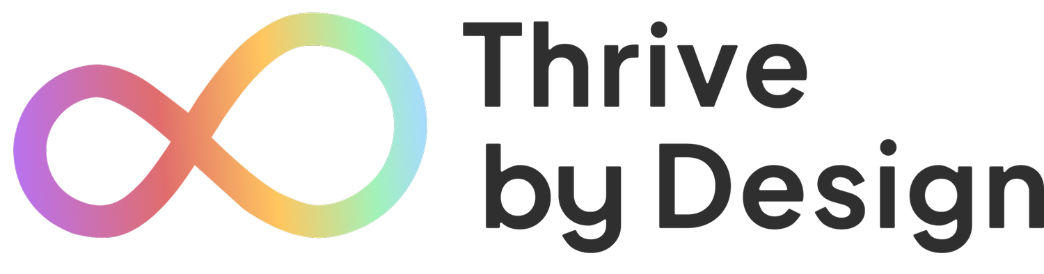
Our primary logo
Wherever possible, we use our primary logo with the full gradient infinity loop and the full tagline.

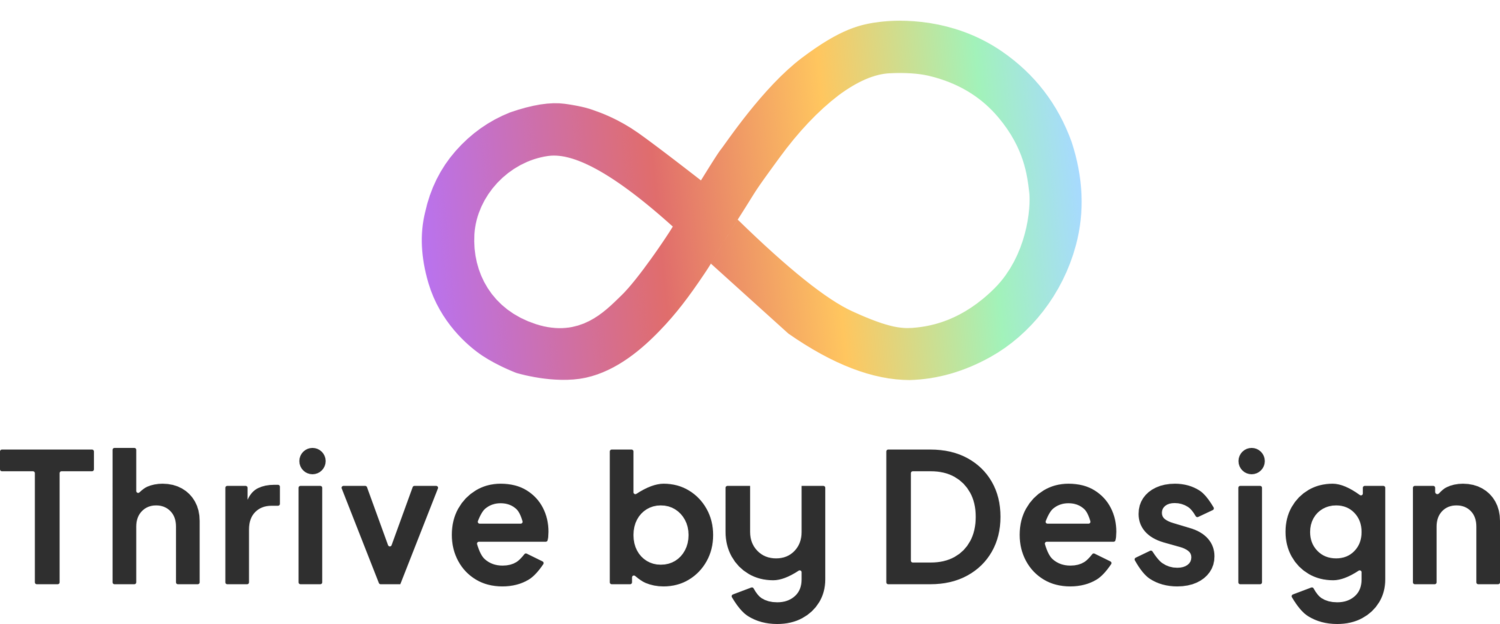
Logo with no tagline
It’s important that our logo is always fully legible. Therefore, if our logo needs to be displayed small, we should use the logo without the tagline which becomes harder to ready the smaller it gets.

Alternative logos
We have 3 alternative logos to be used in the right context.
Alternative 1
As we transition from being known as mHabitat, there may be a need to use the ‘Formerly mHabitat’ logo to make sure people understand that we’re the same team with a new name.

Alternative 2
As we partner with a number of other organisations, we may need to reference that when displaying our logo on our shared work.

Alternative 3
A lot of our work results in written reports that are shared far and wide. We may wish to reference that the work has been complete by us using the ‘A report by’ logo.

You can access and download all of our original logos from this shared folder.
You can access and download all of our updated assets and tools from this shared folder.
Using our logo
Our primary logo should only be used on a white background.

👍

❌

❌
If we need to use our logo on a different background colour, we have a white version of the logo.

👍

👍

👍
We also have a black version should we need to use the logo on a black and white only publication.

Logo spacing
Our logo should always have the right amount of space around it. Below shows that the logo should have an exclusion zone which is at least the same size as the height of the capital T in the logo.

Social logos
We have a range of icons that can be used for avatar images on social media platforms such as Twitter, LinkedIn and YouTube.
These are available in circle
And in square
Our colours
Gradients
Our primary logo uses a gradient of 5 colours. However, for other branding elements such as the social icons, we use two gradients, each consisting of just two colours.
Dark gradient

Start colour: #B972EF
End colour: #E06D6C
Light gradient

Start colour: #A2F2BA
End colour: #A7DAFF
Primary brand colours
We have 3 primary brand colours that we use in our brand assets. The black and dark grey are mainly used for text colour.

Light: #A2F2BA
Medium: #8FD9A5
Dark: #53C976

Light: #A7DAFF
Medium: #7DBDEC
Dark: #41A1E8
Light: #EFEFEF
Medium: #2F2F2F
Dark: #000000
Secondary brand colours
We also have 3 secondary brand colours that we use to complement the primary colours where needed. These should be used sparingly and only where we are unable to use our primary brand colours.

Light: #B972EF
Medium: #9259BE
Dark: #704691

Light: #E06D6C
Medium: #BE5250
Dark: #9E302E

Light: #FFC65F
Medium: #FFB632
Dark: #FFA400
Our font
Our primary font for all written Thrive by Design documents is Public Sans.
You can download the free to use Public Sans font from Google Fonts.
Using our font
Public Sans comes in 9 different weights:

We don’t use the standard BOLD formatting option to emphasise content. Instead, we use different weights. This ensures that the font maintains its intended style.
Our default font style for documentation is:
Weight: Regular
Size: 12pt
Line spacing: 1.5
All of our templates below have been set up with the font styles you need for different headings and body text.
Our templates
We have developed 3 branded templates using Google Docs and Google Slides that we should all be using for our public facing documentation and presentations.
Presentation template

To use the presentation template, in Google Drive select ‘New > Google Slides > From a template’. You will then find ‘Thrive by Design Slides template’ to select and edit.
Report template
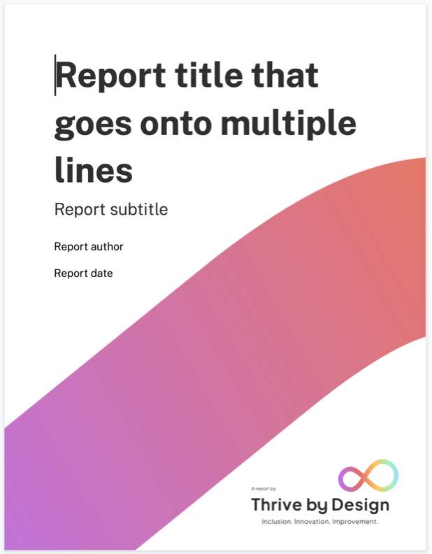
To use the report template, in Google Drive select ‘New > Google Docs > From a template’. You will then find ‘Thrive by Design Report template’ to select and edit.
Briefing template

To use the briefing template, in Google Drive select ‘New > Google Slides > From a template’. You will then find ‘Thrive by Design Briefing template’ to select and edit.
Email signature
Our logo has not been designed to be included in email signatures. In fact, it’s difficult to ensure images in email signatures are accessible, so we don’t recommend using them.
The default email signature to use is:
--
Your Name
Your Role
Thrive by Design - Inclusion. Innovation. Improvement.
Leeds and York Partnership NHS Foundation Trust
Website: www.thrivebydesign.org.uk | Twitter: @TweetsByThrive
Contact number 07123 456 789 (optional)
Slack theme
If you’re interested in using a Thrive by Design theme for your Slack client, you can simply copy and paste the below line of hexadecimal colour codes into ‘Preferences > Sidebar theme’.
#EFEFEF,#F8F8FA,#53C976,#FFFFFF,#53C976,#000000,#53C976,#BE5250,#EFEFEF,#2F2F2F
Our brand guidelines will continue to evolve as we discover new ways in which we need to communicate our work and who we are. If you have any questions about the brand or how to use it, please contact Thrive by Design